Enhancing Medical Info Cards for Better Decision-Making
Company
Sulamérica
Sulamérica
Case Description
Feature redesign within an existing product — focused on improving the doctor discovery and appointment experience in the mobile app
Feature redesign within an existing product — focused on improving the doctor discovery and appointment experience in the mobile app
Platform
Mobile App (iOS & Android)
Mobile App (iOS & Android)
Year
2021
2021
My Contribution
User interviews, Data analysis, Desk research / competitive benchmarking, Opportunity mapping (Opportunity Tree), Wireframing, A/B testing, UI design (doctor card & mini CV), Product performance tracking
User interviews, Data analysis, Desk research / competitive benchmarking, Opportunity mapping (Opportunity Tree), Wireframing, A/B testing, UI design (doctor card & mini CV), Product performance tracking
SulAmérica is one of the leading health insurance companies in Brazil, serving millions of members nationwide. Among its digital services, the company offers a mobile app that allows users to easily schedule medical appointments, connecting patients with healthcare professionals in just a few taps.
The Problem
Data and user interviews revealed that unfamiliarity with doctors made users avoid in-app scheduling. Many chose out-of-network providers and later requested reimbursements — increasing costs and lowering adoption of the digital service.
Impact on users
· Lack of information leads to uncertainty when choosing unfamiliar doctors.
· Making appointments without SulAmérica’s support often results in negative experiences.
· Decreased trust in the platform.
· Making appointments without SulAmérica’s support often results in negative experiences.
· Decreased trust in the platform.
Impact on the company
· Lower engagement with the app’s scheduling feature.
· Increased operational costs due to reimbursement requests.
· Missed opportunity to strengthen user loyalty and trust in the service.
· Increased operational costs due to reimbursement requests.
· Missed opportunity to strengthen user loyalty and trust in the service.


My role was to lead the investigation into this behavior, identify key pain points, and propose design solutions to increase user confidence and drive adoption of the in-app appointment flow.
Below, I walk through the process that led us to the solution.

User Research
To better understand user needs and motivations, I conducted one-on-one interviews with customers who had recently requested reimbursements for out-of-network appointments.
Here are some key findings that helped uncover the main pain points:
Trust
Users want visual and detailed information to feel confident when choosing a provider.
Transparency
Patients seek clear, trustworthy information to make informed decisions — especially in sensitive situations.
Reassurance
Even with nearby options, users hesitate to book without familiarity, revealing a need for emotional reassurance.

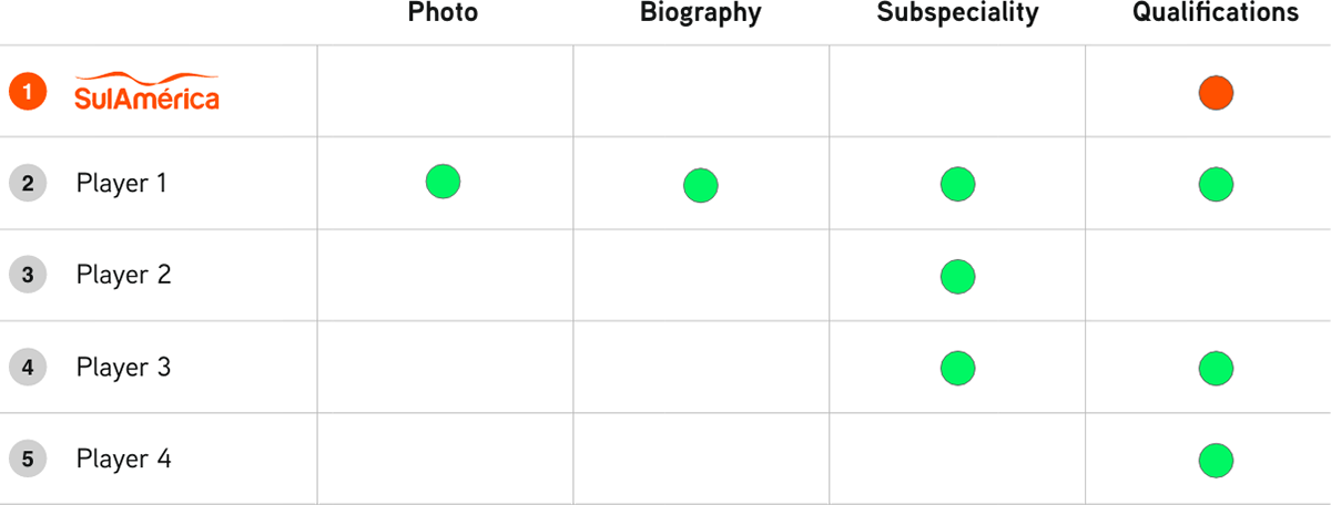
Desk Research
To understand industry standards, I analyzed how competitors present doctor profiles to their users. The key attributes evaluated were:
· Presence of photos
· Display of subspecialties
· Inclusion of biographies
· Listing of professional qualifications
This benchmark helped identify gaps and opportunities to improve our own user experience.

Opportunity Tree & Outcomes
The opportunity tree was instrumental in focusing discussions and guiding decision-making. We mapped both opportunities uncovered during discovery and ideas brought by stakeholders based on their own perspectives and experiences.


Wireframe Mini CV
Following the opportunity tree, I translated the most promising ideas into wireframes — including the structure of the doctor's mini CV — to validate both information hierarchy and layout. This step was key to aligning with stakeholders early on and ensuring the solutions addressed real user needs while meeting business objectives.


A/B Testing
To ensure the solution would deliver value, we ran an A/B test focusing solely on the doctor card — before investing in the design of the mini CV. It was essential to confirm that the effort would lead to meaningful results.
The version of the card with a photo (variant B) received 80% more clicks than the version without it. Both featured the same doctor, confirming that the visual element significantly influenced user engagement.
Encouraged by this positive outcome, we proceeded with the next design iterations, including the creation of the doctor's mini CV.


Final Design
Based on the research and testing insights, the final design focused on two key improvements:
Redesigned doctor cards — now including photos to create visual recognition and increase engagement.
Mini CV section — a concise profile with the doctor’s specialties, qualifications, and professional background, helping users make more confident choices.
These enhancements aimed to build trust, reduce uncertainty, and support users in selecting the most appropriate healthcare provider.


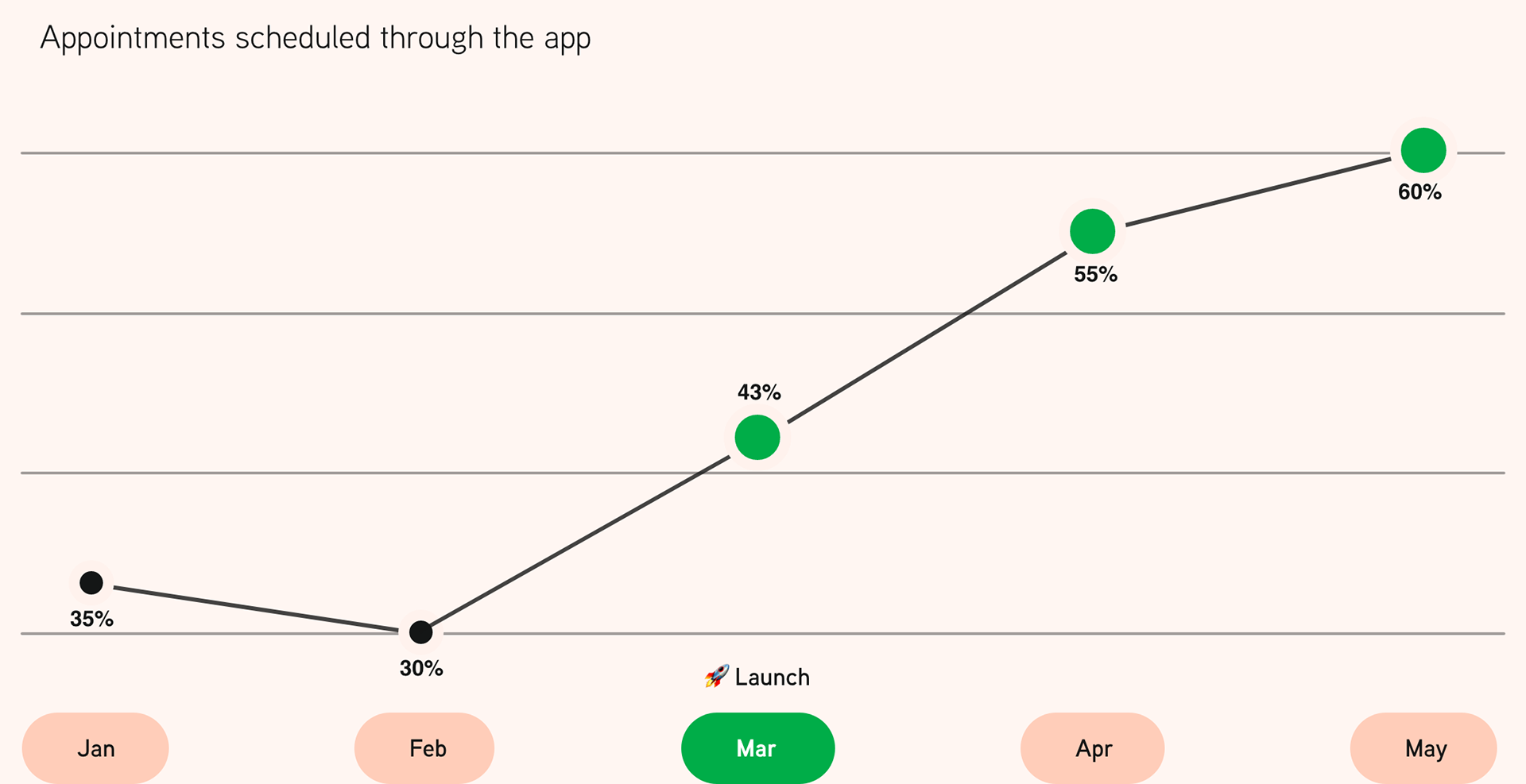
Measuring Impact
After implementing the new design, we tracked key metrics to evaluate its effectiveness. We saw a significant increase in clicks on doctor cards and a positive uplift in the number of appointments scheduled through the app. These results confirmed that the improvements not only enhanced the user experience but also supported business goals by driving higher engagement and reducing operational costs.