AI Recommendation Assistant – SulAmérica
Before I joined the company, SulAmérica had launched an AI-powered assistant to help users identify their symptoms and receive a personalized recommendation for the most appropriate healthcare service.
The Problem
However, despite its potential, user engagement with the recommendation feature remained surprisingly low.
How do these product works?
The user goes through a short flow to describe their symptoms, and the system uses that input to recommend the most appropriate healthcare service.
What pain points does this product help eliminate?
1 · Decrease calls to the call center
2 · Right service orientation
3 · Reduce ambiguity in service usage
2 · Right service orientation
3 · Reduce ambiguity in service usage


My role was to lead the investigation into this behavior, uncover the blockers, and propose solutions to improve adoption.
Below, I walk through the process that led us to the solution.

Data Analysis
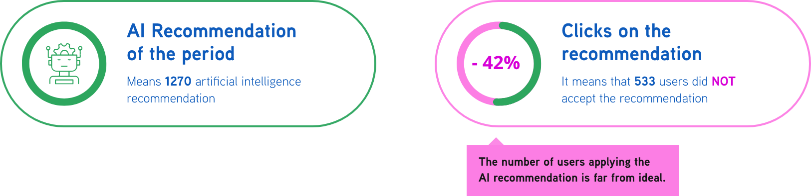
During a routine dashboard analysis, we noticed a decline in the number of users following the AI recommendations over a three-month period.

Research
To understand low engagement with the AI recommendation, we partnered with UX Research to investigate user behavior. We focused on users who completed the journey but did not applied for AI's recommendation.
🤔 Key Questions
· Is the recommendation screen clear and understandable?
· Do users realize that the outcome is personalized based on their input?
· Does the screen follow familiar mental models from other digital services?
· Do users realize that the outcome is personalized based on their input?
· Does the screen follow familiar mental models from other digital services?
✨What I Found
· Some users doubted the recommendation’s reliability.
· The interface didn’t clearly communicate the connection between user input and the suggested service.
· Language and structure didn’t match common digital patterns, reducing user trust.
· The interface didn’t clearly communicate the connection between user input and the suggested service.
· Language and structure didn’t match common digital patterns, reducing user trust.

Insight
Although users didn’t explicitly mention the AI or the algorithm, their feedback focused on the screen layout and the information presented. With these insights in mind, I reviewed the interface closely and took detailed notes for improvement.


Ideation
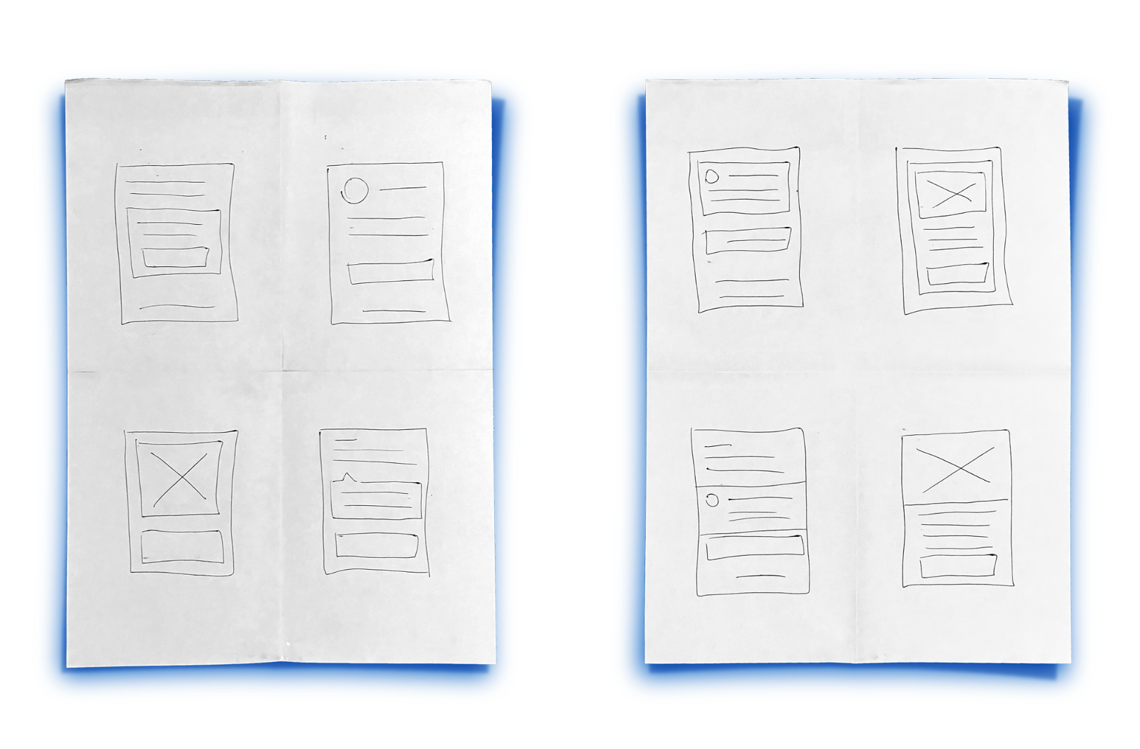
To kick off the redesign, I facilitated a Crazy 8’s ideation session with key stakeholders. This fast-paced sketching exercise encourages participants to explore eight distinct ideas in eight minutes — pushing beyond obvious solutions and unlocking a broader range of possibilities.

Wireframe
Following the ideation session, I translated the most promising concepts into wireframes to validate the information hierarchy and layout. This step was essential to align expectations with stakeholders and ensure we were addressing both user needs and business requirements early in the process.


Final Design
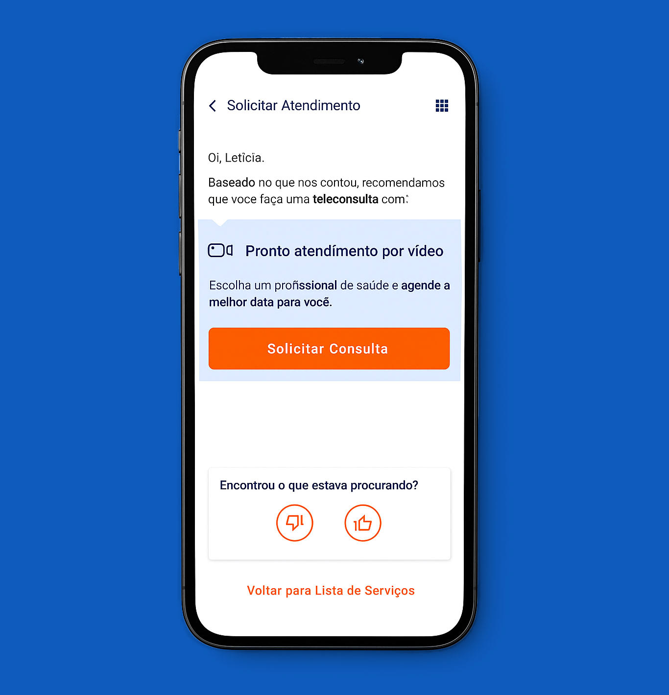
After validating the wireframes with stakeholders, I moved on to the final design, applying the brand’s visual identity and usability best practices. I emphasized clarity through refined typography, spacing, and prominent calls to action. The layout was made responsive to ensure consistency across devices, delivering a clean and intuitive experience that guides users with confidence.


Validation
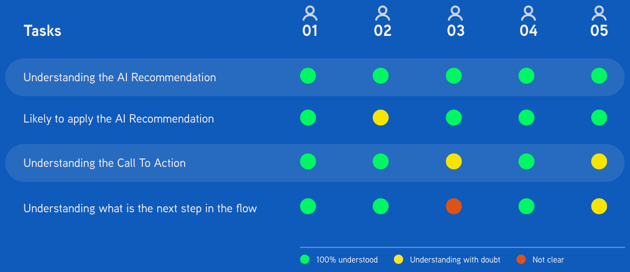
I tested the new interface with five users who had never used the service before. The goal was to ensure the new design was clearer and perceived as more accessible than the previous version.
Each participant tested both versions of the recommendation screen, in random order and without being told which one was new. The result was unanimous: all five preferred the new UI, highlighting exactly the improvements we aimed for in usability and clarity.

Measuring
We monitored performance after the release and saw a clear improvement in engagement. Clicks on the recommendation increased, indicating that the new design made the experience more intuitive and actionable for users.
